What's the best shade of white to paint your NYC apartment if you're trying to sell?
- Brokers, stagers, and designers recommend a clean, neutral shade like white to attract buyers
- Be sure to consider the undertones and finish when choosing a color for your walls and trim
- Warm, creamy whites continue to be more popular than cool, stark whites for most sellers
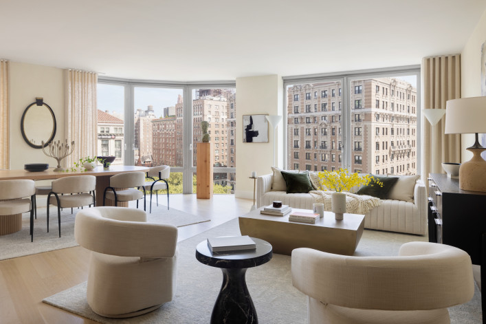
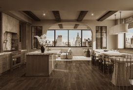
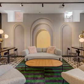
Guillaume Coutheillas of interior design studio frenchCALIFORNIA created a custom white paint for the model residence at 212 West 72nd St., a luxury condo building.
Colin Miller
At first blush, the idea of painting a room or two in your apartment might sound fun or exciting. However, as anyone who has gone on to tackle the job themselves will tell you, the process is its own exquisite form of hell, beginning with the most challenging part: choosing the color.
"So much affects how you see and feel color in each space," said Jennifer Morris, founder of interior design company JMorris Design. For example, poor lighting "can make one color cold or too dark...or too stark. Where windows are facing, the time of year or even the hour, and the location geographically all play big roles in how natural light will affect color."
It only gets more mind-boggling when you decide to paint an interior white, which many sellers do because brokers and stagers typically recommend creating a neutral, clean look to attract buyers.
"White is still the safest baseline because it reads as perceptually neutral, letting buyers project their own life onto the space," said Louise Phillips Forbes, a broker at Brown Harris Stevens.
The problem is, there are dozens of whites to choose from, cool, some warm, with undertones across the spectrum. That's why Forbes emphasized that calibration is critical, notably by choosing a white with the right undertone and light reflectance for the room's daylight and finishes so it feels intentional.
On that note, softer, creamier whites are still trending, said Lisa Lippman, a broker at Brown Harris Stevens, who warned, "Avoid gray, it's out and looks dirty."
[Editor's note: An earlier version of this post was published in November 2023. We are presenting it with updated information for November 2025.]
We checked in with these professionals and other brokers, stagers, and designers to find out their tried-and-true white hues for selling apartments in New York City. Here's what they had to say.
The creamy white craze
If you find white paint too cold, creamier whites are not only still trending but have evolved into a staple for 2025 and 2026, with a strong emphasis on warmer, softer off-whites that replace stark, cool tones.
Designers and major paint brands highlight their versatility and timeless appeal, especially as part of a broader shift toward earthy, grounding neutrals that evoke comfort and nature-inspired calm. This trend aligns with biophilic design—a movement that prioritizes the connection with nature—and a move away from sterile minimalism, making creamy whites ideal for walls, cabinets, ceilings, and trim.
"We're seeing a clear shift in 2025 toward creamier, warmer whites. Stark whites can feel cold and clinical, especially in natural daylight," Forbes said. "In contrast, a softer, creamy white reads more inviting and refined, and it photographs beautifully, which matters because most buyers see a home online before they ever step through the door."
Claudia Allegra Roth, founder and principal designer of NYC-based design firm Claudia Allegra Interiors, echoed that idea.
"When choosing a white for a New York apartment, I always consider how light moves through the space. Pure bright whites can feel stark, especially in city settings where natural light changes throughout the day. I tend to prefer softer, warmer tones that bring depth and calm while still feeling fresh."
Indeed, paint forecasts for 2026 emphasize "new neutrals" like creamy beiges, with creamy whites listed as enduring favorites alongside earthy khakis and soft creams.
The best-selling creamy whites from Benjamin Moore include Swiss Coffee (OC-45) and White Dove (OC-17). Greek Villa (2148-30), Dover White (SW 6385), and Alabaster (SW 7008) are the top creamy shades by Sherwin-Williams. Melodious Ivory (313-2DB) is Dutch Boy's 2026 color of the year.
Other popular off-white colors include Benjamin Moore's Chantilly Lace (OC-65) and Simply White (OC-117), both of which have a subtle hint of warmth while remaining crisp and bright, as well as Pure White (SW 7005) and Snowbound (SW 7004) by Sherwin Williams.
Consider the undertones
Choosing the right white paint hinges on understanding its undertones—the subtle secondary colors that reveal themselves under different lighting and surroundings. Get this wrong, and your room can feel dingy or cold, or your walls could clash with fixed elements like flooring or countertops.
Here's a quick primer on the three main undertone families:
Warm whites have yellow, pink/red, or beige undertones: Examples include Swiss Coffee and Alabaster.
Cool whites have blue, gray, or green undertones: Decorator's White (OC-149) and Extra White (SW 7006) offer a very bright, crisp look.
Neutral whites—like Chantilly Lace, White Dove, Pure White, and Snowbound—have balanced undertones with minimal shift from morning to night.
"My go-to white paint is Chantilly Lace—I have yet to find a project for which it was the wrong choice," said Jeremy Kamm, founder of Rubrik Staging Company and an agent at Coldwell Banker Warburg.
White paints run the gamut at Farrow & Ball, a cult-favorite luxury brand from England, from All White with zero undertones to warmer whites like Joa's White and Pointing, cooler whites such as Cabbage White and Sizing, and neutrals, including School House White and Wimborne White.
Clare Paints, a Black woman-owned company based in NYC, lets you filter whites by their undertones. Those include Whipped and Timeless (warm), Snow Day (cool but not at all gray), and Fresh Kicks (neutral).
Think about the finish
Once you've selected the shade, you still need to decide on the finish. In general, flat or matte paints hide imperfections better than anything with sheen, such as satin or gloss, but those are easier to clean. Eggshell strikes a balance; as such, it is the default wall finish for many professional painters, with flat or matte used on ceilings.
For resale, Forbes recommended keeping things elevated and straightforward. On the walls, she usually goes with matte or soft eggshell because both hide minor imperfections and give the room a more polished feel. For trim and doors, she said satin or semi-gloss works best—they are easy to wipe down, and the slight sheen helps define the architectural details. Ceilings stay flat, often in the same tone as the walls, so the space feels larger and more seamless, she noted.
Lippman, on the other hand, suggests using matte on walls and semi-gloss on ceilings. A semi-gloss finish bounces light off the ceiling rather than absorbing it, making the room feel bigger and brighter; it also draws the eye upward, creating the illusion of a higher ceiling. And, when used with white, the sheen amplifies the light, making the entire room feel more spacious. Caveat: Good surface preparation is essential.
Forbes added that a touch of personality can be memorable in the right spot. "In one of our upcoming listings, the child's room has leafy wallpaper on the ceiling and a custom sculptural flower light. It is playful and subtle, and exactly the kind of detail buyers remember when they are comparing homes."
What the pros are using
"I never choose one white for every space. I always test it on the wall because light and finishes change everything. That said, I love an ivory-leaning white because it feels fresh and clean without tipping sterile. You just have to watch the undertone, so it doesn't skew yellow in intense afternoon sun. My reliable starting points are Benjamin Moore Atrium White, Farrow & Ball Wevet, and Portola Antique White. They behave well across styles." —Linda Phillips Forbes
"I have seen a real swing to a slightly warmer undertone in my and my clients' leaning. We are choosing Simply White over Super White, as it is still clean but has a subtle glow and works well with various colors." —Jennifer Morris
"I have had a staging business for 15 years and systematically use Super White by Benjamin Moore. It works in any setting and will showcase any style of furniture. It also photographs well. Further, it has excellent coverage capacity so does not require as many coats as other shades. Super White is the superhero of whites!" —Veronique Perrin, an agent at Coldwell Banker Warburg
“Our custom West Side Pearl is a soft, luminous white we developed with Color Atelier to complement the natural light and architectural warmth of 212 West 72nd Street. It strikes the perfect balance between crisp modernity and inviting comfort—a white that feels both timeless and livable. This shade is available exclusively to residents of 212 West 72nd Street and can be further customized when they work with frenchCALIFORNIA as part of the building’s interior design concierge offering for buyers and residents.” — Guillaume Coutheillas, founder and creative director of frenchCALIFORNIA
"Creamier or warmer whites create a more welcoming feel in common areas, particularly when working in one of the many classic buildings in NYC. In a space with that beautiful prewar charm, I recommend Behr's Whipped Cream or Whisper White. I lean toward cooler whites—such as Behr's Ultra Pure White or Frost—when working in newer builds and ultra-high-rise units that get significant amounts of light." —Hannah Jackson, an agent at Coldwell Banker Warburg
“I worked as a fashion designer for 20 years, and am constantly updating my home. Lately I’ve been recommending Valspar Swiss Coffee 7002-16, an update from my previous go-to, Bistro White 70006-4. It’s bright enough to make a space feel open and airy, but the soft, warm undertone keeps it from feeling cold or sterile. On camera it photographs beautifully—clean, natural, and timeless—letting the furniture, finishes, and light become the stars of the room."—Linda Nader, an agent at Compass
"I like Benjamin Moore’s White Dove or Sherwin William’s Alabaster to create a warm feeling, and they work well under numerous lighting conditions. Chantilly Lace never disappoints for bright spaces as it gives off a sleek, modern vibe."
—Jennifer Roberts, a broker at Coldwell Banker Warburg
"Beige and cream have become the default neutral colors because they add warmth to the room, and when the moldings are painted either a shade darker or lighter, then the ambiance created is immediately elevated and gives the room a richer and warmer aesthetic. For cream, I use Sherwin Williams Cold Foam SW-9504 (on both walls and moldings); for beige, I use Behr Cotton Knit PPU7-11 (on walls) and Aged Beige PPU7-09 (on moldings)." —Tali Berzak, a broker at Compass
"My favorite white wall color is Benjamin Moore's Swiss Coffee. Don’t be put off by the name. The reason I like it is that it has no yellow, blue, or pinkish undertones. It is a warm white. My other favorite white wall color is Benjamin Moore Cloud Cover OC-25. It also has no undertones and is a little cooler than Swiss Coffee. I would pair Decorator’s White on trim with Swiss Coffee walls and Super White OC-152 on trim with Cloud Cover walls." —Donna Dazzo, owner of Designed to Appeal
"Benjamin Moore White Dove is my go-to neutral white for any home. It's a soft white with a hint of grey, which helps to keep it from looking too creamy (which I believe dates a home). Creamy white was a trend? Not in my book! As for finishes, I recommend eggshell for standard room walls, flat for standard room ceilings and moldings, and semi-gloss for bathroom walls and ceilings. —Ashley Reidy Quinn, an agent at Coldwell Banker Warburg
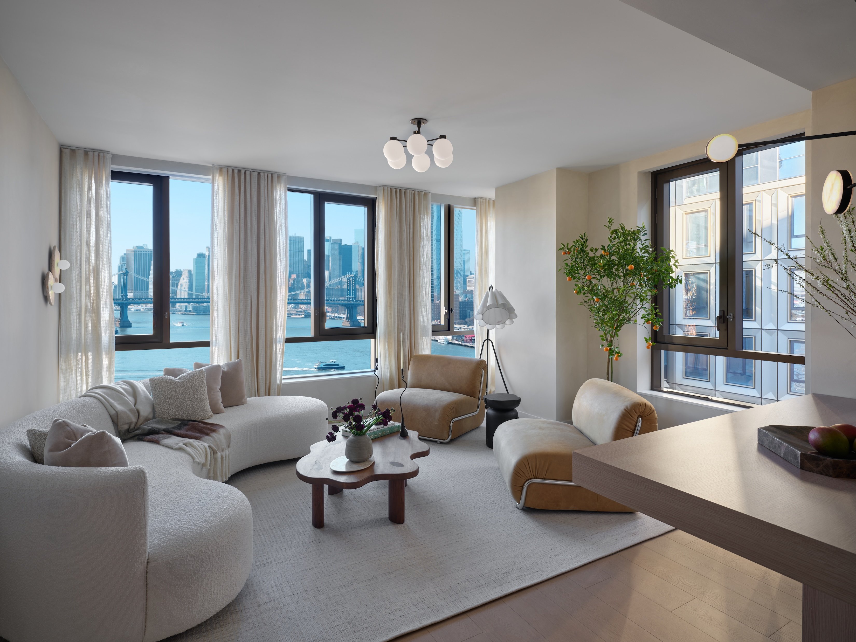
“At the apartments at Williamsburg Wharf [shown below], we used nuanced off-whites that complement the waterfront light and views, including Strokes of Taupe MC-781 by Meoded and Portola Paints' Eastwood, to create an atmosphere that feels refined and welcoming. —Claudia Allegra Roth
The impact of lighting on paint
Choosing the right white paint involves balancing aesthetics, functionality, and environmental factors—the most important of which is lighting.
North-facing rooms get cooler, bluer light so that warmer whites will counteract harshness. South-facing rooms get warm, golden light, causing warmer whites to look even more yellow. Note, too, that LED bulbs (especially cool-toned 4000K+) can make warm whites look dingy, whereas warm bulbs (2700K) enhance creamy whites.
Practical considerations include using durable, scrubbable finishes (such as eggshell) in high-traffic areas, such as kitchens, bathrooms, and hallways, especially if you have children and pets. That said, many people stick with flat or matte and just live with the smudges and scratches (which can be fixed with a little paint, as needed).
Your fixtures also matter. For example, in a kitchen with marble or marble-look surfaces, such as quartz or porcelain, match the paint to the undertone of the veining, not the base color. Warm gray/beige veining pairs well with most warm whites. If the veins are cool gray/blue, the recommendation is to switch to more neutral white paint (BM Chantilly Lace, SW Pure White).
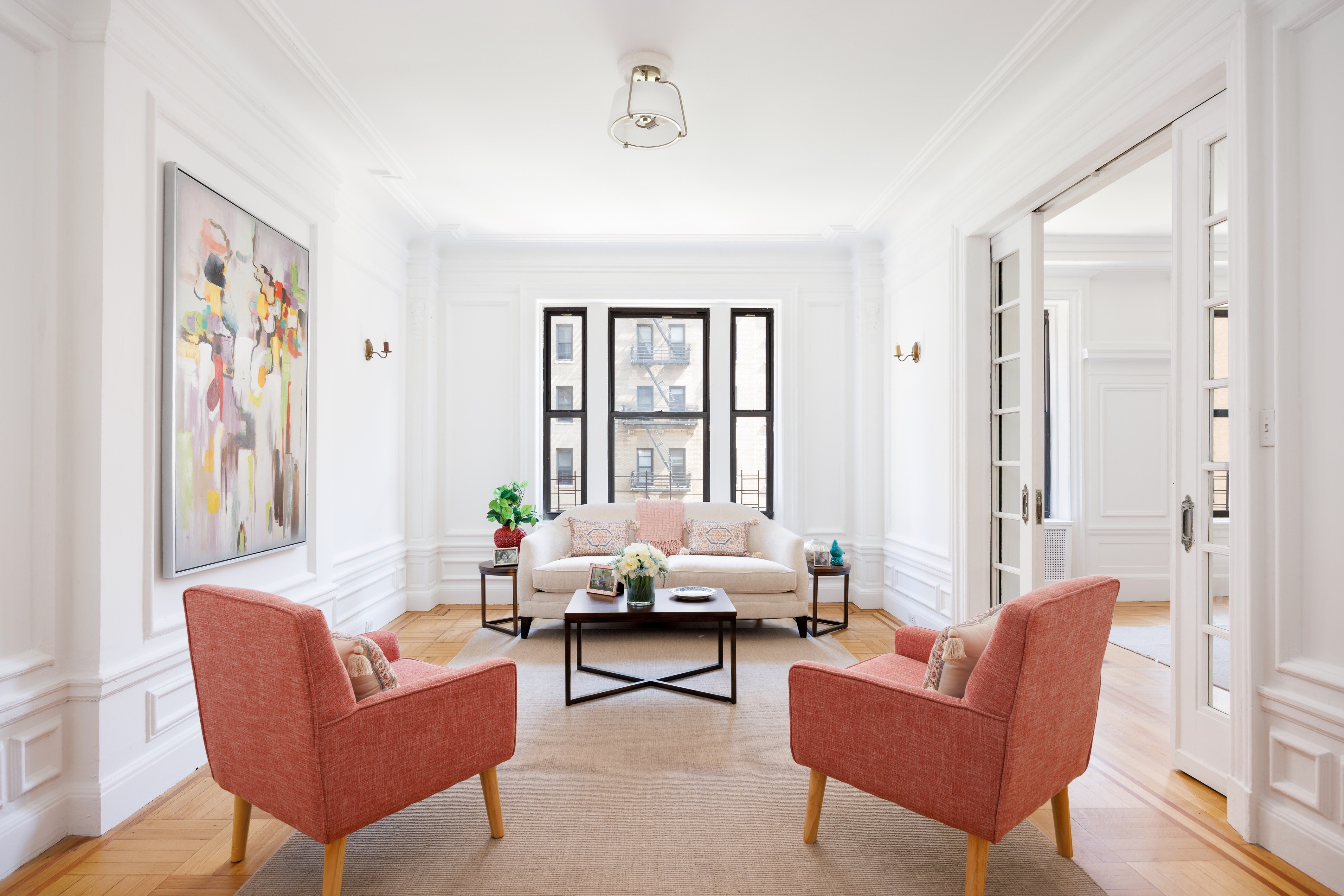
How to bring in color
One tried-and-true decorating approach is to bring in color through furniture and accessories.
"Let the personality come from styling, like a colorful throw, a patterned chair, a great piece of art, or a sculptural lamp," Forbes said. "That way, buyers focus on the architecture and the light. Consistency matters, too. Using the same white or neutral throughout the main rooms makes the home feel larger and more harmonious."
Berzak encouraged choosing a moodier paint color to make small spaces like hallways and powder rooms stand out.
"Alternatively, using wallpaper for half the wall or painting an accent wall in an intense color is a good way to make it come alive," she noted. "It's also fun to play up textures like limewash and Venetian plaster (it looks gorgeous in cream tones if done well), and to consider Fine Paints of Europe for a high gloss option—it's a fun look for a wet bar wall.
Roberts also mentioned painting one wall in a muted shade, such as a light grey or sage, to add depth to a room. "You want a wall color that can photograph well and feels clean, not dated. Avoid colors that feel too specific. Buyers have to be able to imagine the space as their own."
And what if you just do not like white paint? Kamm agreed that white is not necessarily the most stylish or design-forward approach, but it is certainly the safest and easiest.
"That said, there are rooms where depth and mood can dramatically elevate the buyer experience during a home tour. Powder rooms, dens, dining rooms, libraries, and media spaces often benefit from darker neutrals, rich jewel tones, and thoughtfully chosen wallpapers. By adding a level of sophistication, visual interest, and a sense of curated luxury to the home intrinsically, the perception and intrigue become more memorable and emotionally compelling," he said.
On the other hand, Perrin emphasized the need to think of your home as a product you are marketing.
"Do not go with what you like, go with the most neutral choices you can make. I always tell my clients, 'Think vanilla!'" She, too, pointed to accessories as the magic touch that brings it all together. "Something as simple and instant as the right pillows and throws will completely transform a room. But the MVP is the correct rug!" she said.
Ways to test your choices
Always sample in situ, testing swatches at different times—whites can shift dramatically from morning to evening and under different artificial light sources. Compare selected colors side-by-side with a pure white sheet or sample to reveal their undertones.
Buying sample cans is only one way to go, as you may not be keen on painting swatches on your walls (or multiple foam boards) when deciding among multiple shades. Instead, explore peel-and-stick swatches (such as by Samplize, which offers discounted bundles for "warm whites," "white creams," and "off-white warm colors," among other common palettes) that you can reuse on different walls of the same room or in different areas. Benjamin Moore and Sherwin Williams now offer these removable swatches as well.
When evaluating paint with existing kitchen or bath surfaces, lean the large swatch directly against the marble or other slab in your actual light, and if it glows together, you’re golden. If it fights, go cooler.
—Earlier versions of this article contained reporting and writing by Mimi O'Connor.
You Might Also Like


