


 in the Lower East Side, NYC. In the foreground is the East River and East River Park under renovation. These were the tallest reinforced concrete apartment structures in the United States at the time of their construction.")


New map let's you see just how bad your commute will be when the L train shuts down
If you rely on the L train for your daily commute, you probably already know that once it shuts down for repairs in 2019, your daily transit headaches will increase exponentially. But if you want to see just how much time you'll be adding to your commute—or at least, plan ahead—you can do so with the NYC Transit Explorer, a newly-launched interactive map of the city's transit options.
The Transit Explorer is a collaboration between urban-focused tech company Sidewalk Labs and Transportation Alternatives, and shows not just potential routes between two points, but your general access to locations across the city, as well as what those options look like when you increase walking time, add in the bus as a potential option, and other such filters. Crucially, it lets you filter out the L train as a commute option. Meaning that for Bushwick-to-Midtown commuters, a commute that currently looks like this:


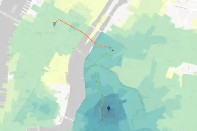
Will look like this once the L is out of service:

The green and blue coloring throughout the map also show your general transit accessibility from your selected starting point—areas that are in blue are relatively close and accessible, while areas that are grey or yellow are not. Notice how much more yellow Manhattan gets for north Brooklyn commuters once the L is taken out of the equation. (Though waterfront residents should take this with a grain of salt, since East River Ferry routes aren't currently included.)
As Sidewalk Labs developer Dan Vanderkam writes in a blog post explaining the new tool, "Even residents who don’t use the L will feel the pinch, as extra travelers squeeze onto subway cars, buses, and roads across the city’s already-packed transportation system."
On a brighter note, however, there's also an "exclude this line" filter for the new 2nd Avenue subway, meaning that you can see commute times before the new stations opened:

And after:

For apartment hunters, there's also a filter that lets you compare routes between two separate starting points, the better to determine the convenience of your respective commutes from two different neighborhoods:

The idea here is, in part, to highlight the potential difficulties brought on by the shutdown of the L, and encourage the city to aggressively pursue solutions. (Transportation Alternatives, which collaborated on the map, are advocating for a car-free 14th Street while the L is down, though that likely wouldn't do much for the Brooklyn and Queens residents stranded by repairs.)
A representative for SidewalkLabs also tells us via email that they'll continue building on the map (they're taking suggestions for improvements here), and will add any new buses or subway trips that the city adds during the shutdown.
You can see an instructional video here, play around with the map itself here, and if you feel like exploring even more L train-related graphics, see another map of potential "L-mageddon" effects here.
You Might Also Like


