Before & After: Brick Underground founder Teri Rogers shares her UWS co-op renovation
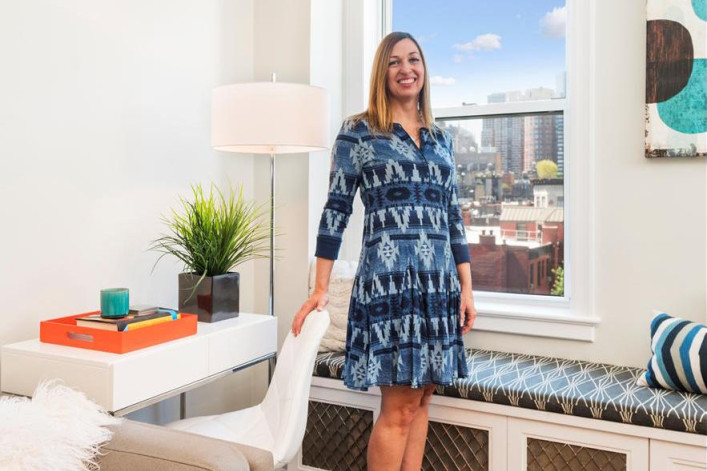
A bright, beautiful baseboard-to- bathroom renovation for Brick Underground founder Teri Rogers’ Upper West Side co-op (Photos via Gotham Photo Company)
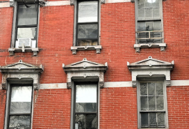
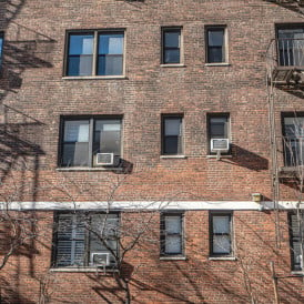
A dozen years and a boom-bust-and-boom real estate cycle ago, my husband and I bought a two-bedroom prewar co-op on the Upper West Side. Though situated in a modest 10-story brick elevator building, the apartment was, in real estate terms, a triple threat.
First: location, location, location. The ninth-floor apartment was within a few minutes walk of Central Park as well as two major subway lines (including the amazing 1/2/3), Fairway and Citarella, and P.S. 87, where our 5-year-old daughter could enroll in a good (free!) public kindergarten.
Second: Space and separation of space. The rarish 1,150-square foot “classic-five” had a large separate dining room off the kitchen that could do double duty as a home office, as well as an actual entry hall leading to the living room; a sound-muffling foyer separated the living room from the two bedrooms.
Third: We were buying the apartment directly from the sponsor, which meant the board interview was just a formality and our bid for the apartment would not falter on the shoals of our thinnish finances.
As a sponsor apartment, it had been a rental for many decades, and looked it—from the 16 layers of cracking paint that encrusted the moldings and doors, to the slapdash sponsor-renovated kitchen and screen-less cheap aluminum windows that required the strength of a wrestler to open or close.
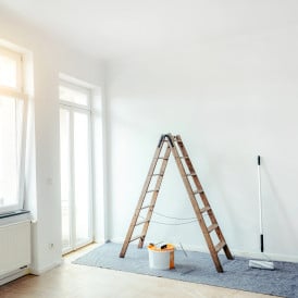
We fixed what we could afford to at the time: We undertook a hasty, inexpensive update of the kitchen, installed a new bathroom sink and toilet, skim-coated the walls and slapped fresh paint over everything that wasn’t moving. Then we spent the next decade watching it slowly disintegrate while we waffled between addressing one project at a time or taking a knife to the entire place and upending our lives with a head-to-toe renovation that would require moving out.
Eventually we decided to take the plunge, overcoming successive stages of sticker shock as we interviewed contractors and architects. A year passed before we hired our patient, practical, down-to-earth architect Jean-Luc Briguet, who unlike another architect we interviewed, did not try to convince us, a family of three, to remove our precious half-bath because it was ‘gross’ for a bathroom to adjoin a kitchen.
Jean-Luc introduced us to our contractor, Apolon Construction Group's Erion Hasko and Bardh Gjoni, and all were tasked with a total refresh of our family home. The to-do list included replacing our compact kitchen with one that could accommodate two cooks without expanding its footprint or changing the configuration; replacing all the moldings and doors throughout the apartment; gutting and reconfiguring our main bathroom so that two or three people could comfortably share it at once; installing a long desired window seat across one side of the living room to take advantage of the open southern views and add storage; and liberating vast swaths of closet space from their prewar prison in our master bedroom.
The actual renovation took five months, with no major surprises or delays, greatly aided by the watchful, organized and fastidious on-site management of Bardh (now with BCNG Construction), who must have been a Swiss train conductor in a previous life. Jean-Luc, our architect, selected most of the finishes, joined toward the end by Alex Caratachea, a very talented lead designer at Decor Aid, an interior design firm that charges a flat per-project fee and passes their trade discounts to clients. Alex helped us choose most of our new furniture, window treatments, rugs and light fixtures and styled our place for its “after” photoshoot.
Below, a room-by-room overview, with photographs taken by Gotham Photo Company, which specializes in making apartments camera-ready for sale.
The Kitchen
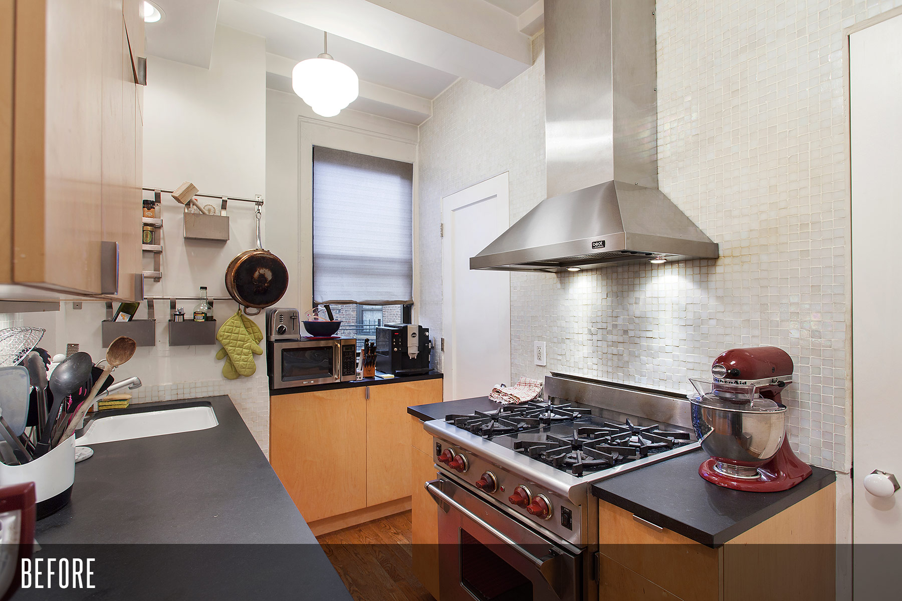
As someone who loves to cook, I wanted a brighter, durable, more efficient chef’s kitchen that looked great without sacrificing a molecule of functionality. I also wanted room for the occasional company of my husband/sous chef. Unfortunately, expanding the footprint of the kitchen wasn’t feasible. The cheapest and easiest way would have been to expand backwards, eating up our tiny laundry room and our half bath—both worth their weight in gold in any New York City apartment. Expanding forward would mean working around a gas line that ran up the center of the kitchen or relocating it, which would have been expensive and may not have been allowed by our building anyway.
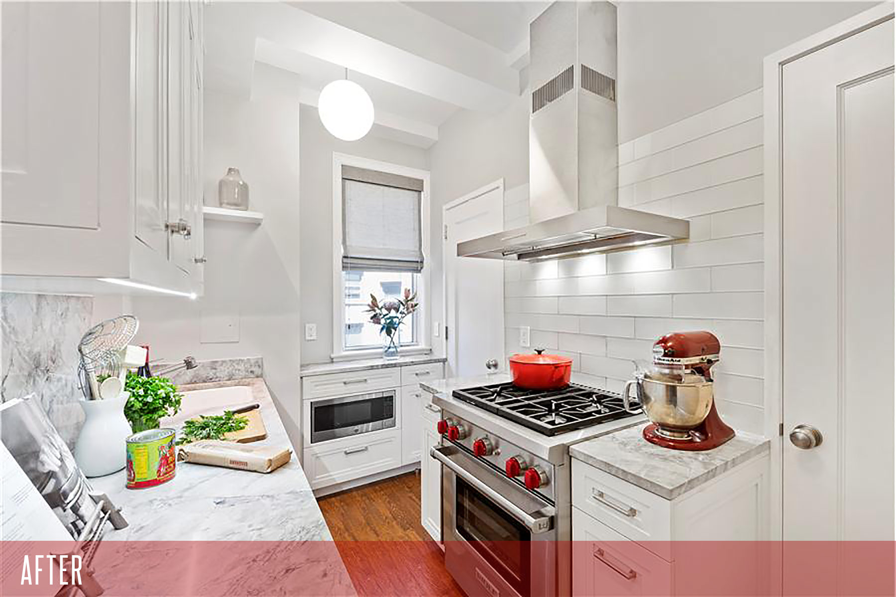
We compromised by creating a second work station by the window and demoting the microwave, which we use infrequently, to a nook built into the cabinetry below. The toaster and the espresso machine were banished to the dining room, where our cabinet maker built a bar/cabinet with electrical outlets. The kitchen knives are now out of sight in a silverware drawer with a specially designed knife slot section.
(Photos via Gotham Photo Company)
Another huge boost to efficiency was the custom cabinetry. Built like fitted furniture by master craftsman Eric Englander Cabinet & Furniture, the cabinetry features stepped custom inset moldings at the door panels, finished side panels, and dove-tailed ¾” thick drawers with self-closing hardware, a small tweak that surprisingly makes even the smallest task—opening and closing drawers—feel luxurious. In addition to being more thoughtfully designed to accommodate items like a blender and two pull-out recycling bins, the lifespan of this cabinetry should be significantly longer than the cheap builder’s grade laminate cabinets we installed when we moved in.
We chose light materials, including a light semi-gloss paint with a touch of gray on the cabinets and a slightly darker gray on the walls above the translucent gray 4" x 12" glass tiles from Nemo Tile & Stone to provide a crisp contrast. For the countertops, we wanted to mimic the look of marble as much as possible with a more durable material that could withstand heavy, messy cooking (including my habit of putting hot pans directly on the counter). We swapped the old black granite countertop with a polished Quartzite White Macauba 1 ¼” thick slab selected with Jean-Luc’s help from ABC Worldwide Stone in Brooklyn. (It’s even stronger even than granite, the sales rep told us, and so far we have no complaints.)
Also, you can’t see this in the picture, but the window shade (like all other window treatments, ordered from The Shade Store, taking advantage of Décor Aid’s 20% discount), lowers from the top as well, so if we want privacy and light at the same time, we can lower the top and the bottom.
Dining Room
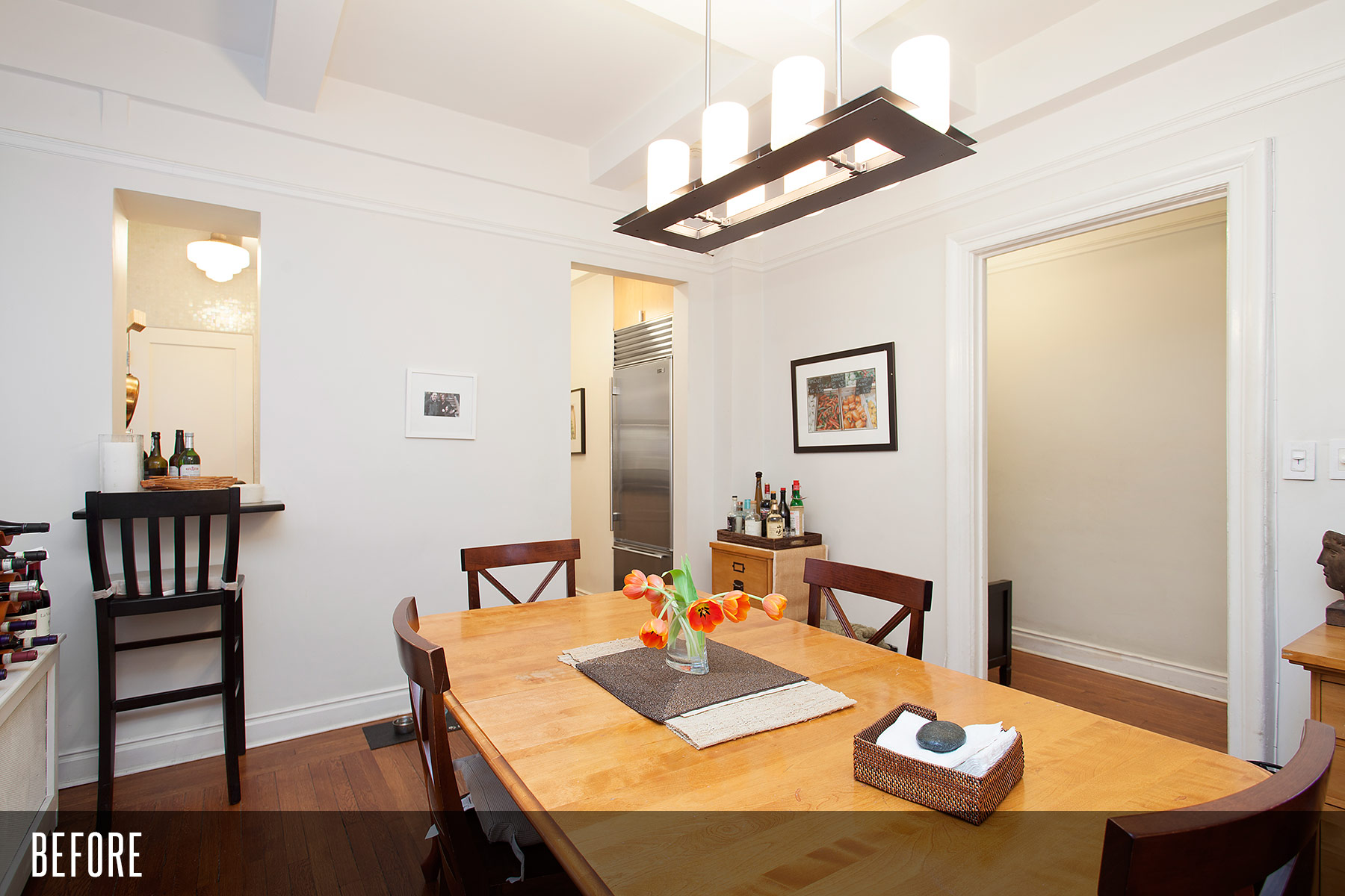
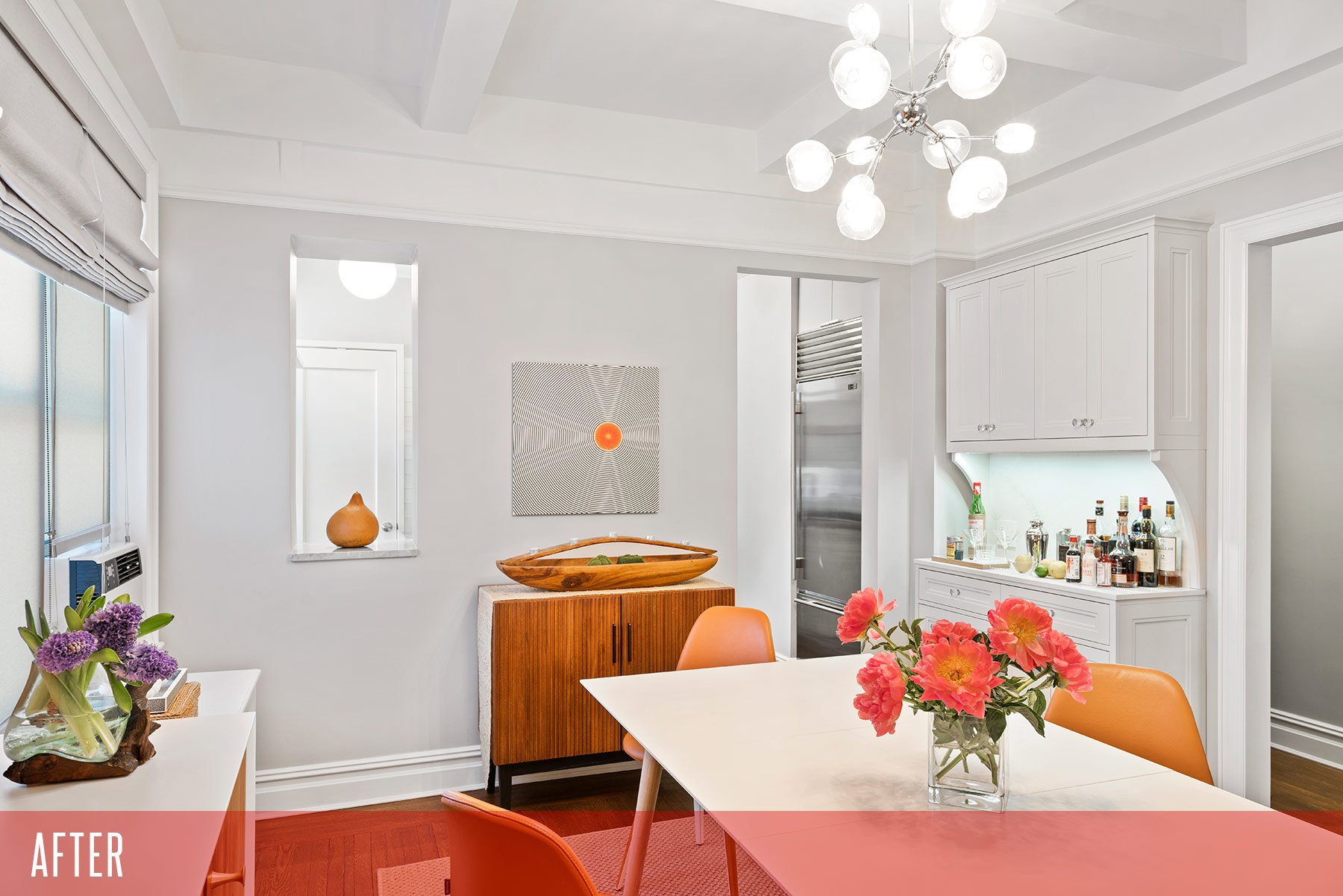
Our main objectives in the dining room were to carve out room for the items we’d removed from the kitchen, like the toaster and espresso machine, create a more formal space for a bar than the filing cabinet we’d been using, and add some additional pantry space.
We also wanted a cleaner, brighter, more streamlined look overall in terms of the furnishings and decorating, as most of the furniture was a hodgepodge of cast off items and furniture from our previous home.
Our architect Jean-Luc designed a custom hutch similarly detailed to the kitchen but with minor design changes. It was painted in the same light gray as the kitchen cupboards to make a seamless transition from room to room. We chose furniture with a Midcentury vibe and created a more open feeling by removing the barstool at the pass-through window to the kitchen. (Sidenote: Every single architect and decorator we spoke to wanted to close up our pass-through and put cabinets on the kitchen side, but we insisted on keeping it because it made conversation flow easier between the two rooms and it was the only way to get cool air into the kitchen via the window unit in the dining room—and you definitely need cool air when cooking with a commercial-style stove, even with an outside-venting exhaust fan.)
(Photos via Gotham Photo Company)
Living Room
Along with a big, bright modern decorating refresh and all-new moldings and doors we added through the apartment, the main improvement in the living room was the addition of a wall-to-wall window seat where we can lounge around and enjoy the view instead of (like I used to) balancing on top of a metal radiator cover. The left side of the window bench conceals the radiator behind custom metal grilles Jean-Luc sourced from England and the right side provides extra storage. The window seat has become the true heart of the living room. It’s also where guests tend to gravitate to (can’t say I blame them).
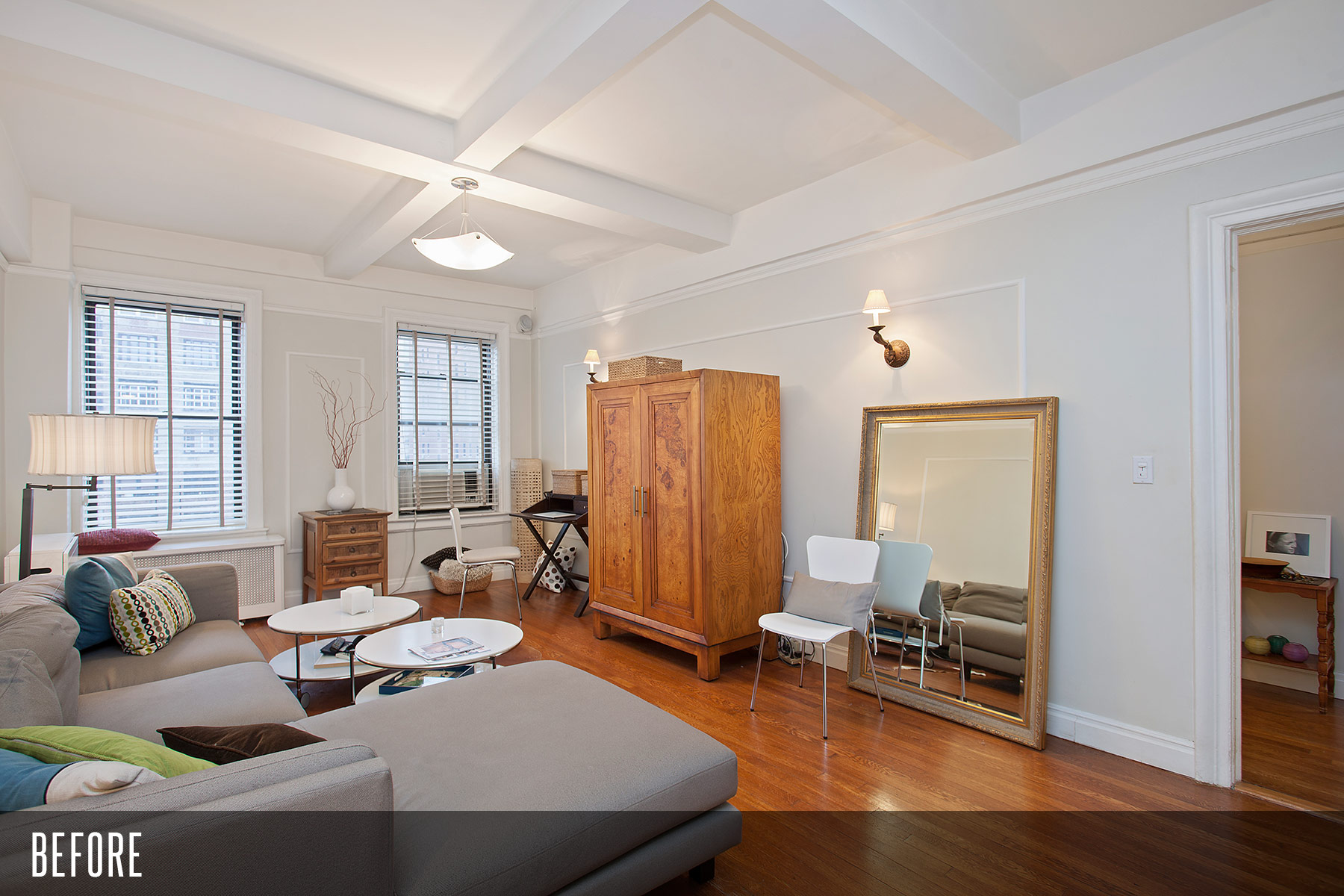
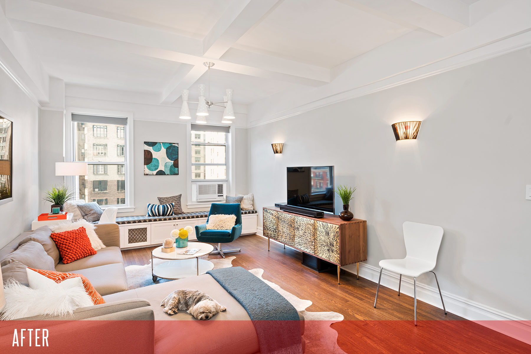
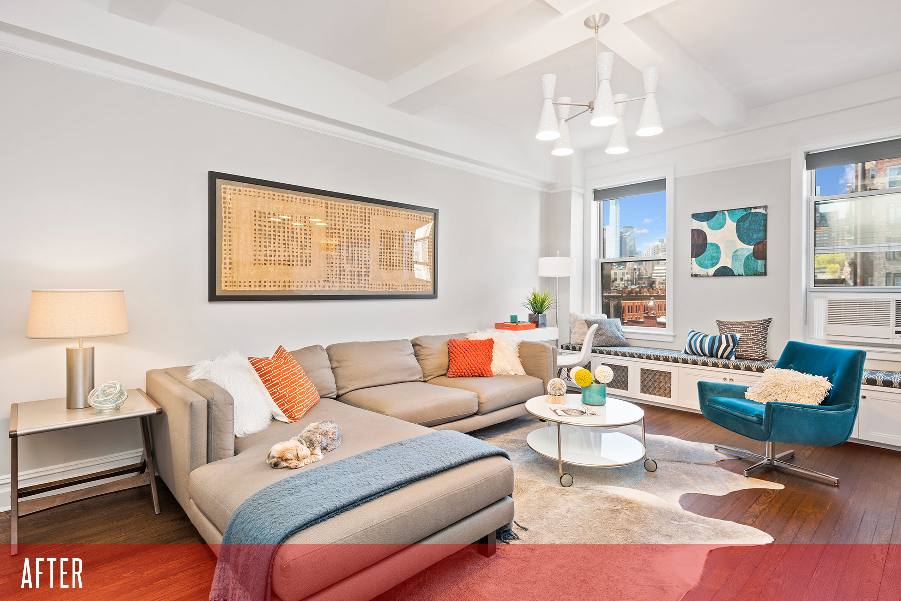
(Photos via Gotham Photo Company)
The foyer
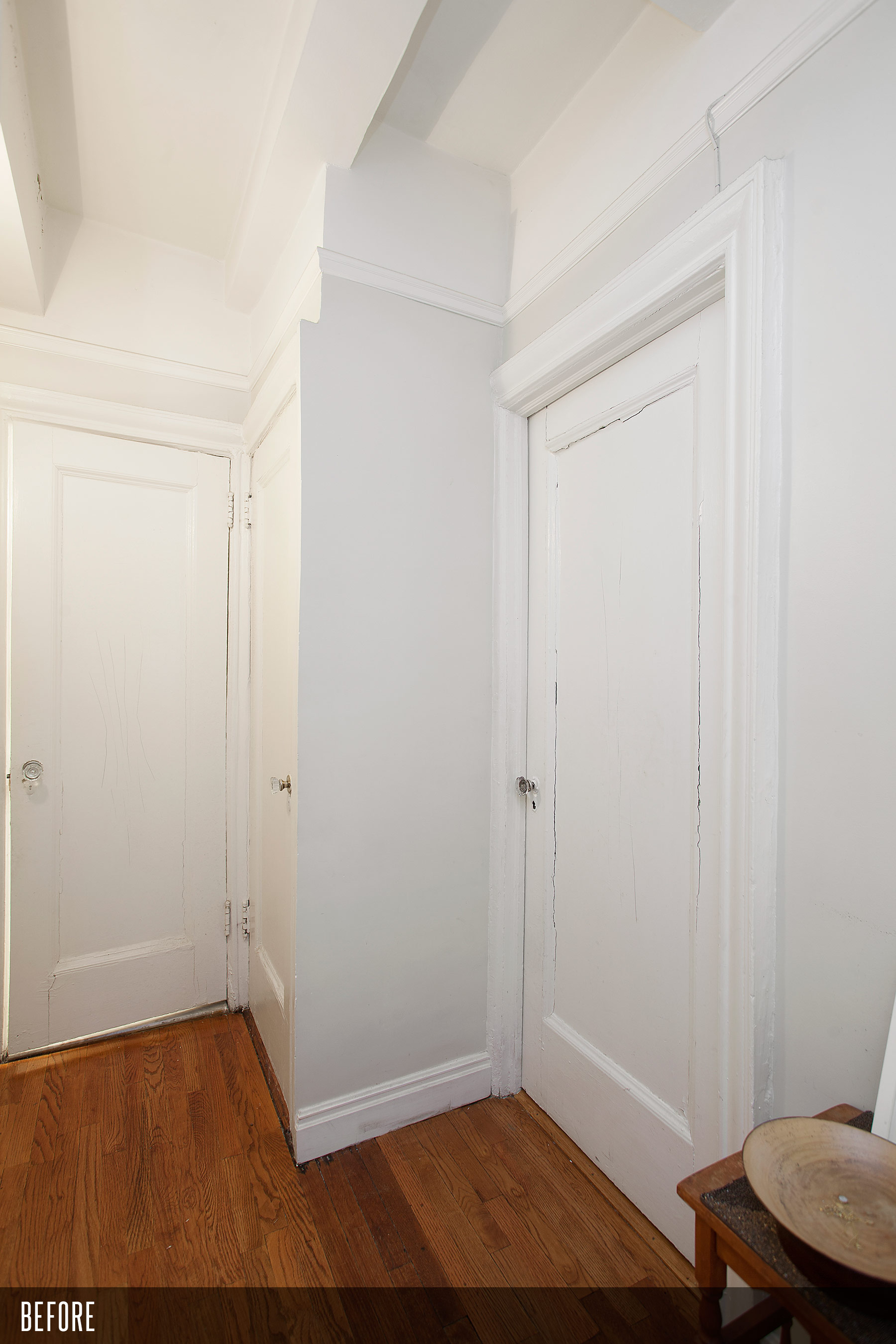
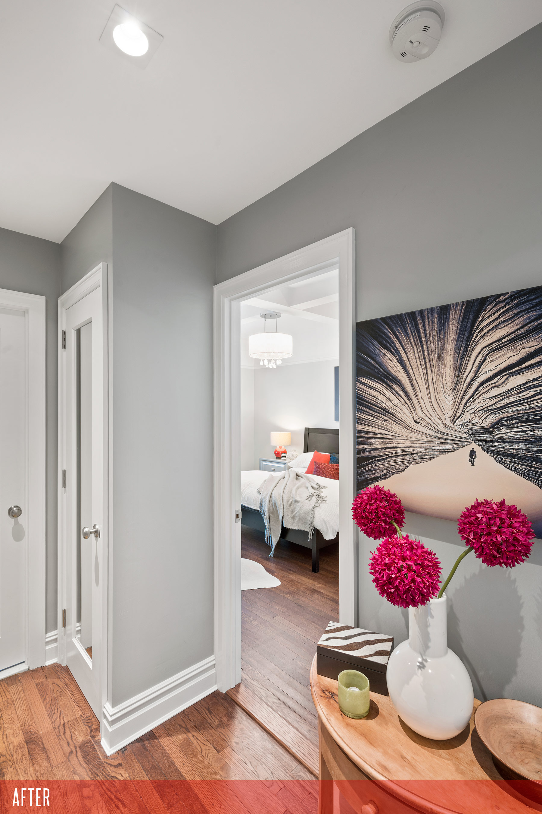
Our contractor tried to convince us to drop the ceiling in the foyer in front of the bedrooms and main bathroom and install lights but we were reluctant to spend the extra couple of thousand dollars they quoted. They believed in it so much they wound up doing it anyway and not charging us. I have to say they were right. And with the new molding, doors and overhead lighting, it’s the perfect anteroom for changing when someone is sleeping in.
In picture below, you can get an idea of the terrible shape the old moldings and doors were in.
(Photos via Gotham Photo Company)
The Bathroom
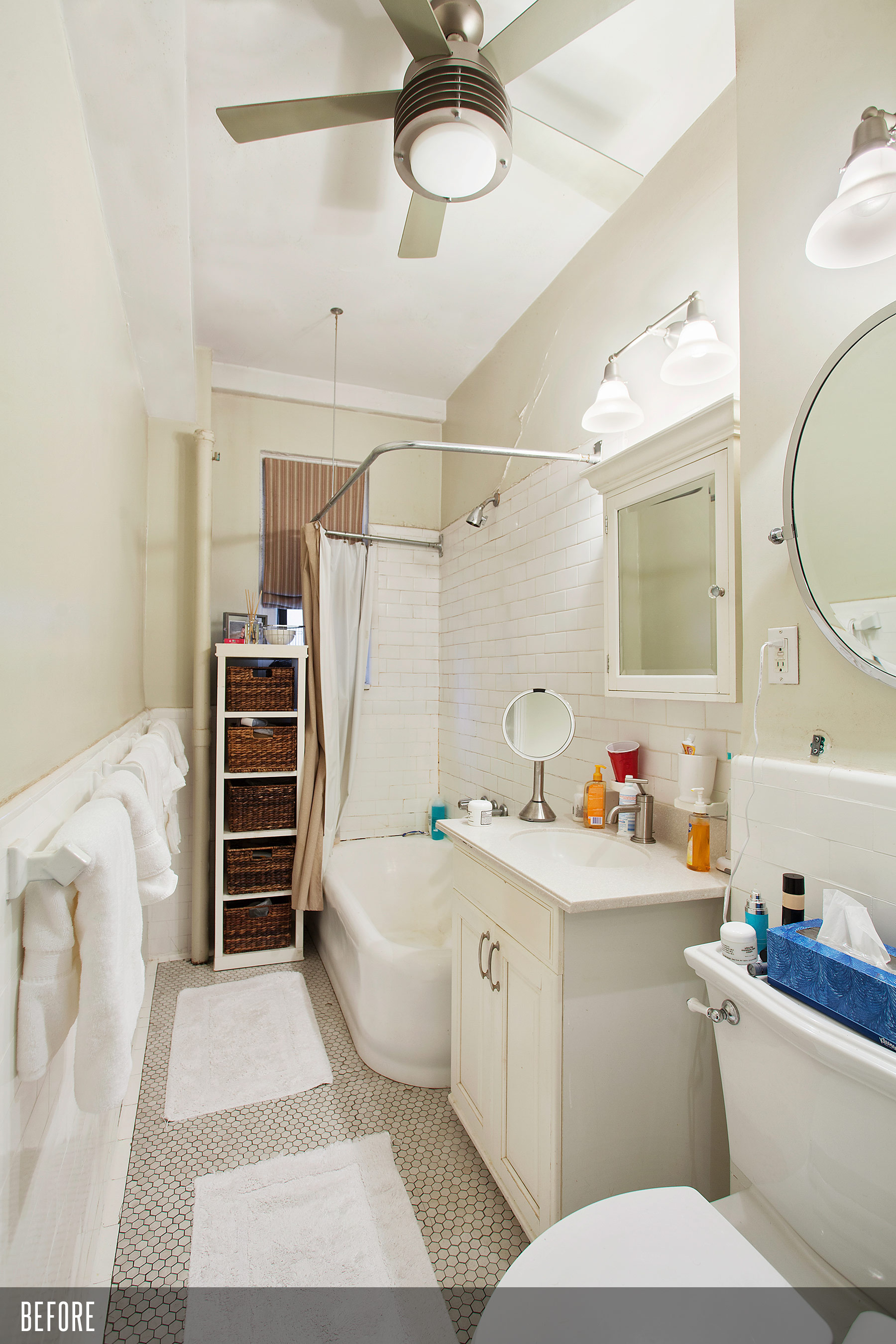
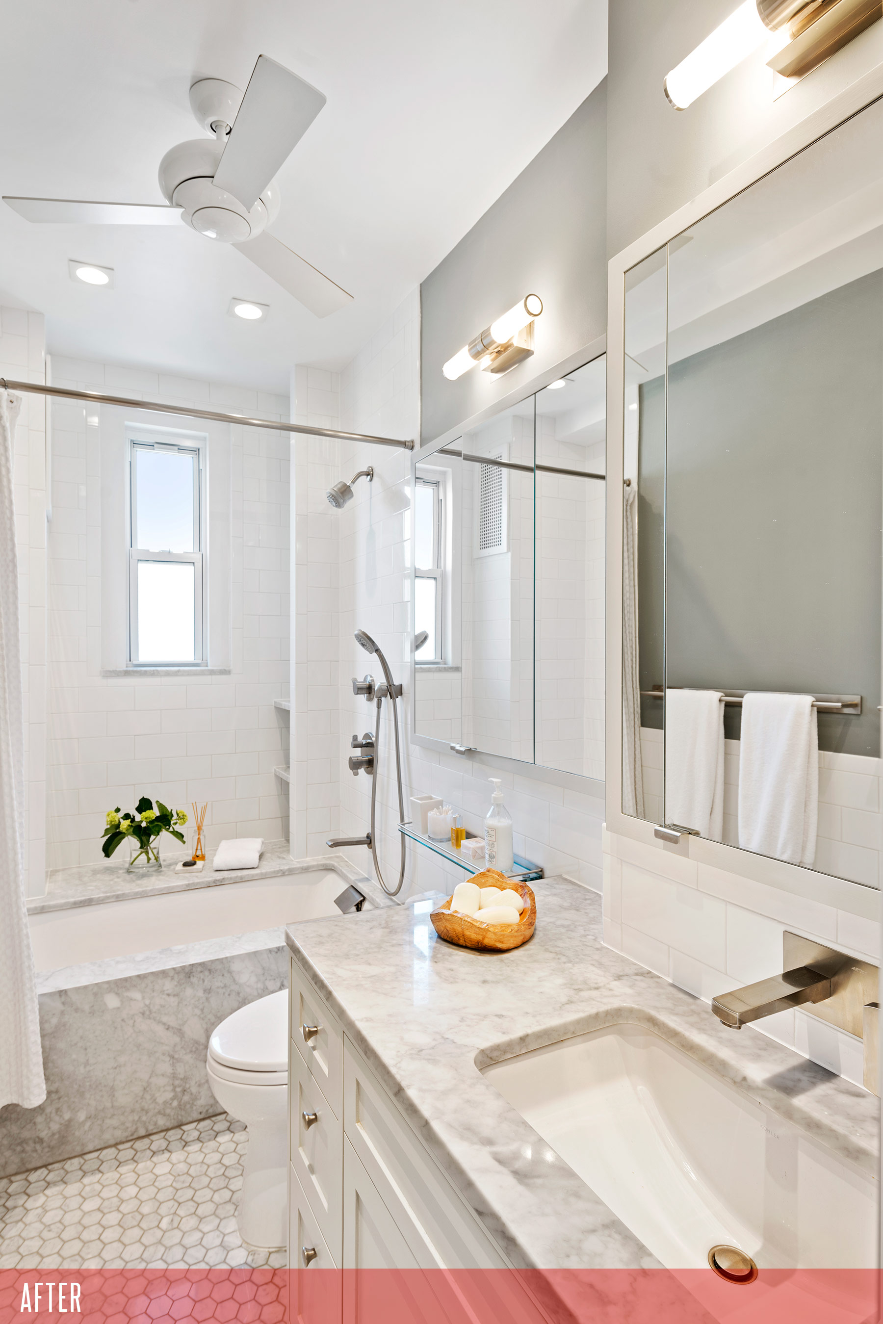
This was the most amazing transformation in the whole renovation. I still can’t believe this bathroom is ours to use everyday.
The old one was long and narrow with the tub situated along the side of the bathroom and the window sort of hidden. Now we can shower with the window open, weather permitting, gazing at this beautiful view of Manhattan, which reminds me of a sixth-floor Paris walk-up apartment I stayed in college. Two or even three of us often use the bathroom at the same time—one person can be in the shower, while one or two people can be using the sink and long line of mirrors.
To get there, we had to work within many tight constraints further complicated by reversing the location of the toilet with the vanity. Jean-Luc, our architect, designed a perfectly fitted custom vanity with deep drawers to the left of the sink and a wall-mounted faucet, giving us more counter space than our original bathroom.
Our contractor opened the wall above the vanity which gave us 6 feet of storage behind mirrored cabinets. The new tub was turned 90 degrees and mounted underneath a Bianco Carrara stone slab which continues to the front face. Our contractor perfectly mitred the corner to make it seem like a large block of stone.
Hexagonal Bianco Carrara stone mosaic tiles from Nemo Tile & Stone cover the floor while inexpensive 3x6 white subway tiles accentuate all the Bianco Carrara stonework throughout. The bathroom is basically fitted together like a ship’s cabin with every inch carefully considered (hence going with a wall mounted faucet, to free up counterspace) and taking into account building plumbing and structural constraints.
(Photos via Gotham Photo Company)
Master Bedroom
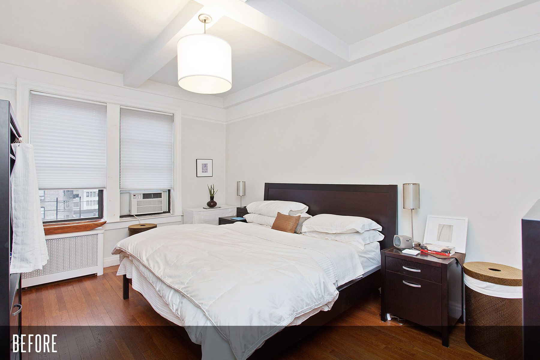
In the master bedroom, we wanted to create a serene but sexy boutique hotel look. Alex, from Décor Aid, suggested the gray velvet curtains and gray silk shades and the glittering overhead light. The practical magic is hidden behind the four new 8’ 6” closet doors that finally allow us to unlock every square inch of closet space functionally out of reach at the sides of the old prewar closets, until we opened up the walls. The very economical and efficient geniuses at Creative Closets did the built-ins.
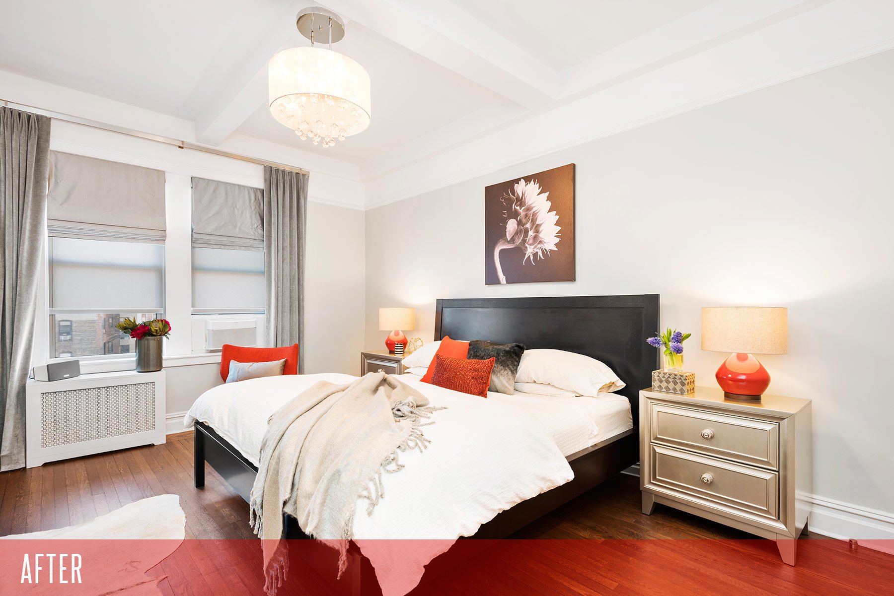
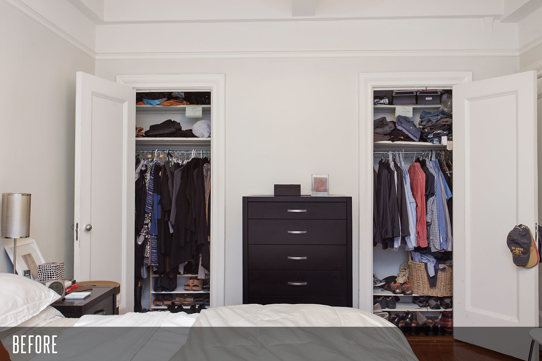
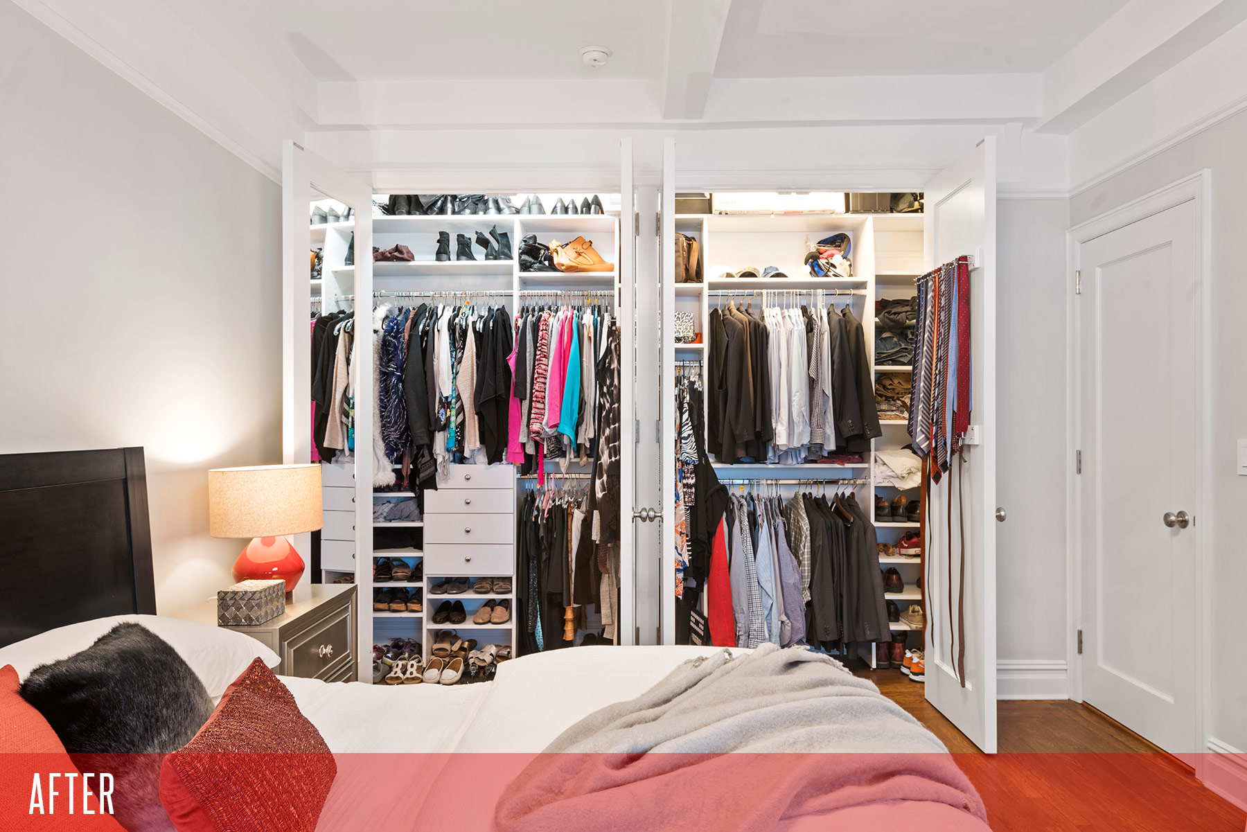
(Photos via Gotham Photo Company)
Second bedroom
Our daughter’s bedroom hadn’t changed too much since kindergarten, still sporting the rickety furniture and the small bookshelf I had painted myself before she was born. With less than a year to go before college, her room was finally upgraded to teenager status.
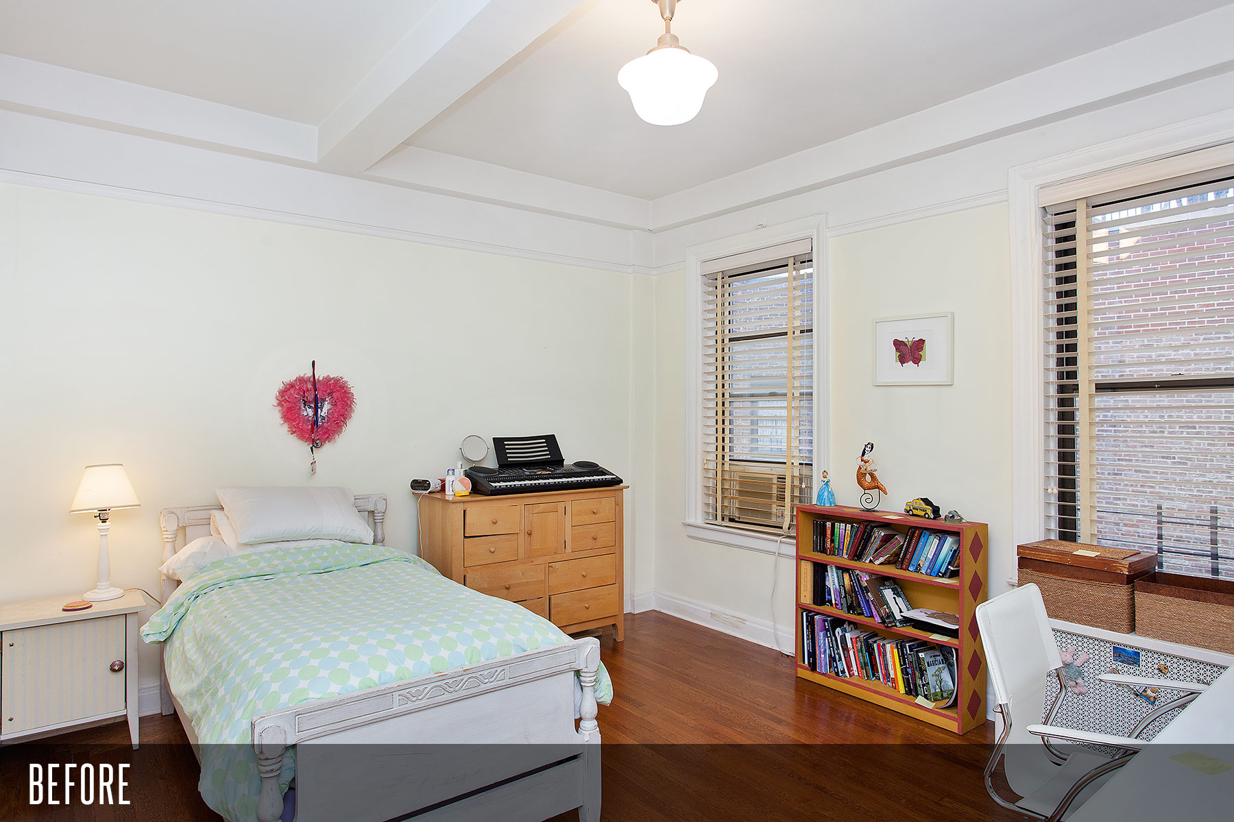
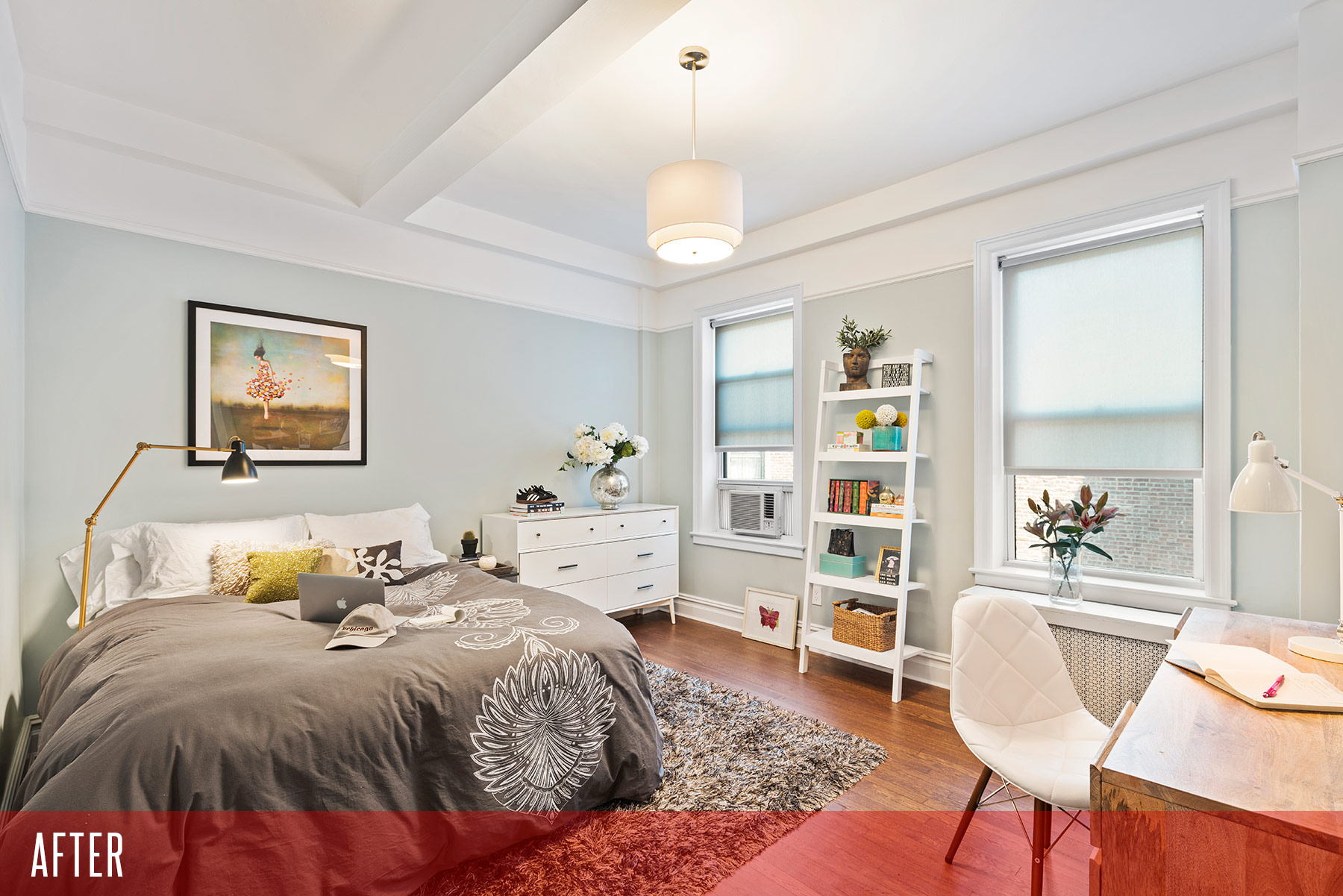
(Photos via Gotham Photo Company)
Resource List
Architect:
Jean-Luc Briguet
917-597-3943
Contractor:
Apolon Construction Group
212-537-6801
Designer:
Alex Caratachea
Décor Aid
1-800-887-9198
Tile:
Nemo
212-505-0009
Countertops:
ABC Stone
718-389-8360
Cabinet maker:
Eric Englander Cabinet & Furniture
917-648-6871
Closet interiors:
Creative Closets
914-376-9700
Photography:
Gotham Photo Company
877-545-8458


