NYC Renovation Chronicles: Creating new paint colors, and getting stripey
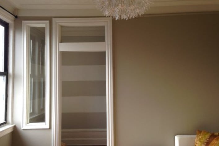
As is often said, a paint job is the cheapest and easiest way to change the look and feel of a room. But it's also one of the hardest things to get right.
Even carefully considered colors can surprise you once you see them, full scale, on your walls. Maybe you only examined the paint samples two or three times in the day and didn't see how it's purple in the early morning and pink during dusk. Or maybe you didn't consider how it would play off the floor and furniture color scheme. It's enough to make your head spin.
In our case, having gained a whole extra room (okay, half a room) after converting a portion of our living room into an office/guest nook, we felt like we got a decorating wild card. With room to play and experiment, we had some fun with paint.
Making use of extra paint
Almost a year ago, we bought two gallons of paint for the dining room. We had chosen Sea Froth by Benjamin Moore. When we first put it on the walls, I hated it. It ended up looking too close to mauve during certain parts of the day. I wanted to find out how to at least tone it down by using neutralizing or grounding colors in curtains, rugs, etc. (Hint: we chose a lot of neutral grays. ) Now, I honestly love how the dining room looks. But there was another issue with that paint purchase: we had too much paint.
Though Benjamin Moore paint is more expensive than some other brands out there, word on the street is that their paint formulation gives better results in terms of coverage and durability. Their paints have a high concentration of pigments (instead of being diluted with solvents to make up the same volume of paint) and so the color is more saturated.
In other words, we didn't really need to buy two whole gallons of paint. We had three quarters of a can full left over. That can had been sitting in a box for a year. But now was the perfect opportunity to bring it out of its retirement.

A tint of paint ($3) added to an older can of paint made for a whole new color.
The amount of paint leftover was perfect for the office. But the paint color was not. Luckily, I had since become more familiar with the color wheel. In order to neutralize the purple in Sea Froth I would add a tint of its complementary color, green. Off I went to Home Depot to pick up a $3 tube of Sheffield Tints-All in Spring Green.
Mixing it up
Let the fun begin! We didn't have a paint mixing paddle attachment , so we fashioned one out of an old wooden spoon by carving the tip of the handle to a point that would fit our drill.

Then we added color drop by drop, mixing thoroughly between each addition and testing a bit of the color on a white background (left over ceiling tile samples from this project! ).To my utter delight, the end result was a gorgeous, neutral, light gray.

The mixing in motion.

The gray, already mixed paint, ready to go.
The science of stripes
For the next fun part of the project, I wanted to add horizontal stripes for a bit of interest, and because I wanted to give the room a more spacious feel. Generally, horizontal stripes make a room feel larger, while vertical stripes make the ceiling appear higher.
We painted our new gray on the walls as the base color and allowed it to dry thoroughly. (We made sure to keep some paint for touch ups, and also for locking the edges. I'll explain later.)

The base color is an attractive gray.
Then, using a level and a pencil, I plotted out where the stripes would go. I decided the pattern would be made with broad, 15” stripes - the same width as our baseboards. So, the baseboard itself made the first stripe, since we were using the same color for stripes as the baseboard. I proceeded to make marks all around the room, taping out the stripe’s edge with painter's tape before measuring the next stripe up.

Using a level helped ensure straight lines.
It was a bit tricky to get the lines straight from one end of the wall to another, and around corners. But using a level made it easy to make minor adjustments, ensuring acceptably straight lines.
Tip: when taping out the pattern, tape outside of the pencil marks so that the paint can cover the marks (instead of having to wait for the paint to thoroughly dry and then erasing them).
Unfortunately, not all painter's tape is created equal, and some just don't adhere properly, peeling away from the surface. I find Scotch Blue Painter's Tape to be most reliable.

Mayra finds Scotch Blue tape to be most reliable for painting stripes (no, they did not pay her to say that).
The Scotch Blue tapes also claim to have "edge lock" capabilities to prevent paint bleeding through. In my experience, some bleeding always occurs. But a great tip for preventing this is to paint a thin layer of the base color (which we made sure to keep back) on the edge of the tape where the stripe will go, essentially "locking" the edge. Let it dry for a few minutes, and then paint over it with your stripe color. I suggest using a small roller (mine was 6”) for this.
I prefer painting with a roller because it’s quicker than a brush, and gives a smooth finish. I used a small roller instead of a full sized one because it’s easier to stay within the lines when filling in the color.
Take care not to apply too much paint to the edges, where the tape meets the stripe. I found that too much paint soaks the tape and softens the edge, making it possible for paint to bleed through anyway.
But don’t worry, touch ups along the stripe lines are easily done with a foam brush. If the smudges are really tiny, just dab on some paint with your finger. No one will notice.
Oh, and another tip: many rookie painters (I mean, I can't be the only one!) make the mistake of waiting too long before pulling up the tape after painting. Allowing the paint to dry and form a skin over the tape may cause the paint to be pulled up with the tape, leaving you with gashes in your new paint job. I only waited the time it took for me to put away the tools and wash out the rollers - ten minutes, tops.
Marking out where the stripes would go was the most time consuming part of the project, taking one person about an hour to do in that tiny room. But the stripe painting itself barely took an hour. And can I just tell you: there are few things in renovation more satisfying than peeling off painter's tape at the end of job revealing crisp lines and totally new room.
Never understimate the joy that comes from peeling off painter's tape to reveal crisp lines of paint.
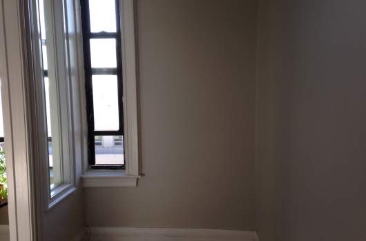
The study before paint.
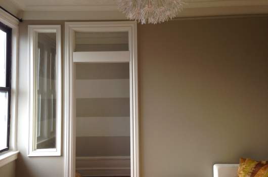
A view of the study from the living room, post-paint job.
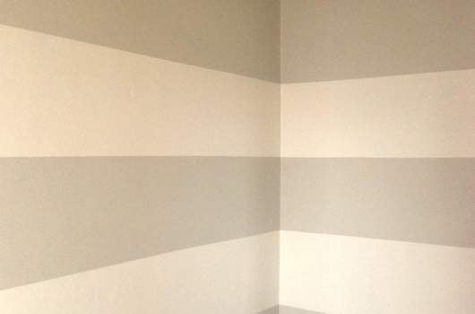
Another close-up of the study after paint.
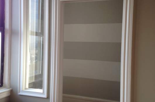
A view from the living room.
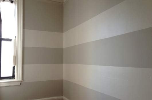
Mayra used the DIY method to make horizontal stripes on her new office's walls.
NYC Renovation Chronicles is a bi-weekly column focused (obviously) on renovation, NYC style. Helmed in the past by an architect, a kitchen and bath designer, and a general contractor, the column's new steward is co-op renovator, real estate porn addict and Harlem resident Mayra David. She'll focus on what it's like to DIY or HSI (= Hire Someone Instead) in NYC.
Related posts:
NYC Renovation Chronicles: 3 DIY projects worth trying yourself
NYC Renovation Questions: What are the best paint colors for an apartment?
12 things to know before painting your NYC apartment


