


What the entrances of NYC luxury and historic buildings tell us about who lives there

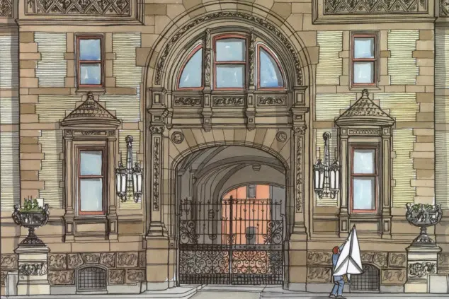
A watercolor illustration of the entrance to the Dakota in “Posh Portals: Elegant Entrances and Ingratiating Ingresses to Apartments for the Affluent in New York City," a new book by Andrew Alpern.
First impressions convey a great deal, and for that reason author Andrew Alpern looks at entrances to New York City’s luxury and historic residential buildings in his new book, “Posh Portals: Elegant Entrances and Ingratiating Ingresses to Apartments for the Affluent in New York City.”
But most of all, an entryway says a lot about the people who live in the building.
“If you want to attract posh residents, you have to be able to make the entrance welcoming as well as safe,” Alpern tells Brick Underground. “You want the entrance to show that you can enter only if you have legitimate business in the building. At the same time, you can’t make it look too forbidding or too much like a fort.
“The design has to be appropriate to the building and also has to appeal to the socio-economic level of the target market. As I write in the book, the entrance is the opening sentence of the architectural story that sets the mood of the building,” he says.
In this, his 11th book (eight of them are about the luxury homes of the rich and famous) Alpern has chosen 168 buildings that he considers the very best examples of the city’s “posh portals.” The book is lavish, a beautifully laid out mix of text, photographs, and paintings, nearly 300 pages in all. The photographs are by the New York-based architectural photographer Kenneth Grant and the 30 (often quirky) watercolors are by the Australian artist Simon Fieldhouse.


Alpern writes an introduction to each building, including the name of its developer and architect and some interesting reveals about the building’s backstory. An example: He writes that the widely cited theory that the Dakota got its name because of its remote location is actually a myth and, as the author of “The Dakota: The History of the World’s Best-Known Apartment Building," he ought to know. He says that the developer chose the name simply because he was fond of western names; he had hoped that nearby avenues would be named Montana, Arizona, and Idaho.
Several of the buildings in the book feature porte cocheres but one in particular deserves special mention. It’s the one at 1107 Fifth Ave., built for the exclusive use of just one tenant, the businesswoman and socialite Marjorie Merriweather Post. Post would be driven up to her private entrance, go into her private lobby, enter a private elevator and ride up to her apartment, a 53-room triplex penthouse created to reproduce the rooms of her former mansion, which had stood on the same site. Not surprisingly, that apartment holds the record as the largest ever constructed in New York.
In describing the entrance way of 720 Park Ave., Alpern writes that the building was commissioned by Isidor Straus, the president of R.H. Macy’s. Straus, who was Jewish, had the building constructed as a place for his family and a number of his friends to live. In the 1920s, when 720 went up, Jews were not welcome in the grander buildings on Park Avenue.
Although Alpern’s book is all about entrances, the book includes photos of practically all of the facades of the buildings. He wants readers to look up and take in the splendor and extravagance of the upper floors of the buildings as well as the entrance way. He wants them to really see the structures around them, to notice and appreciate their often amazing details. He’s convinced that “observing what’s around you and questioning what you see is the best way to explain why the city is the city it is.”
A good way to read through Alpern’s book (after you’ve checked the index to see whether your building made it in) is to make a list of buildings that appeal to you, ones that you’d like to see for the first time and ones that you’d like to see again. A map on the inside front cover will make that easier and help you plot your course.
Brick Underground had a few questions for Alpern. Here is what he had to say.
I have to ask: Do you live in a building with a posh portal?
I’m afraid not. I live in a plain vanilla brick tower built in the late 50s, early 60s. I bought my apartment when I was 21, even before the building went up, and moved in a few years later. I’ve been here for 58 years.
How did you decide to write this book?
I didn’t really decide to write it. Like my other books, it just happened. The process was organic. I met Ken Grant, the photographer, when I was writing my book about the Dakota and contacted him about using some of his photos of that building in the book. He agreed. The same type of thing happened with the painter Simon Fieldhouse. I came across a watercolor of the Dakota that he had painted and loved it so I called him in Australia where he lives to ask if I could use it for my book. He said yes. Time passed and one day I was telling Ken about some buildings I’d noticed that had impressive entrances and he said that he had photos of all of the ones I mentioned. That’s when he said, “Wait a minute, I think there’s a book here.” And so there was.
How did you make your choices?
I chose buildings that I consider to be both distinctive and interesting. I started with the Dakota with its entrance arch, then the Apthorp with a bigger arch, then the Belnord with two arches. Looking at those three buildings made me think about the Graham Court at 1725 Seventh Ave. in Harlem and how it looked so similar to the others. I discovered that it was, in fact, the prototype for the Apthorp, designed by the same architects. After that, one building led to another.


What are your own favorites?
Forty-four West 77th is a favorite of mine with its original wood doors that lead into its flamboyant Gothic lobby. Even though nearly all the terra-cotta embellishments of the building are no longer there (they were defective when installed in 1909, were replaced, but eventually had to be removed in 1945) it’s still one of the most distinctive eye-catchers ever produced by any architect in New York.
740 Park is an excellent example of a building with discreet good looks but I like the distinctiveness of the West 77th St. building better. Just half a block south from 740, at #730, is another one of my favorites. I love its over-the-top embellishment. Its four-and-a-half story facade mimics a Renaissance-period English country house, an effect produced by just a few inches of limestone pasted onto the front of an apartment house. Remarkable.
Any surprises as you put the book together?
I found two surprises, both in Brooklyn. The first is an apartment complex with the preposterous name of Chateau Frontenac. It’s on a street called Tennis Court, #25-35. Have you ever heard of that block? I was taken by the over-the-top triple arched entrance court in the style of the French Renaissance of Francois I. I’m happy to report that the building’s faded elegance is being restored by an enlightened corporate owner and even the security fencing and gates show sensitivity, taste and a measure of flair.
Another delightful find was 711 Brightwater Ct., an Art Deco building in Brighton Beach, which is now home to many people from Russia. Its Art Deco entrance is trimmed in black and gold, a combination that I think of as uniquely Russian.
What are some of the lesser-known entries?
We put a section at the end of the book that we titled “Discreet Doorways and Lesser Luminaries.” (As you may have already guessed, I am very fond of alliteration.) These are buildings that, though not as grand as some of the others, still deserve a place in the book. The architects of these smaller apartment houses are often just as interested in dressing up their entrances as those who design grander edifices.
We’ve included in this section a few buildings on Ocean Avenue but unfortunately, the section called “Disfigured Dignity” consists of five buildings on that same avenue. They are sorry sights. Security gates on entry arches, anachronistic glass blocks and a steel door are painful to behold when they exist beneath splendid ornament.
All but a few of the entries were built decades ago, but a few are 21st century buildings, mostly designed by Robert A.M. Stern. Why?
I am a huge fan of Robert A. M. Stern and have included his NYC buildings, including 15 Central Park West and 70 Vestry St. He has produced superb buildings all over the world and I became an admirer when I was writing about Rosario Candela. In his buildings, Stern emulates the appearance and luxury of what Candela produced in the 1920s, but he’s re-tuned it, reflecting what apartment buyers of this century require, or at least what the one-tenth of one percent want.
You Might Also Like


