


Track income, crime, rents, and more with the NYC data map to end all data maps
Data maps tracking everything from Airbnb rentals to Halloween 311 complaints have become hugely popular over the past few years, and a new, interactive tool—data2go.NYC—may have just blown them all out of the water.
The project just launched yesterday, as reported by Bedford + Bowery, is the result of a year's worth of hard work by nonprofit Measure of America, inspired by the statistics-based approach of the United Nations Human Development Reports. “Our overall goal is to breathe life into numbers so that others will be able to improve the well being of New Yorkers and reduce inequality,” Sarah Burd-Sharps, one of the site's creators, told the blog.
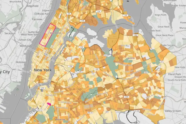
Data 2 Go lets users browse neighborhood-by-neighborhood data on a huge number of factors including school enrollment, food systems, median income, housing prices, foreclosures, rent burden, air quality, commute, and more. (Be warned: it's all too easy to lose an entire afternoon playing around with this.) Once you click on a specific neighborhood within the map, you'll be shown a drill-down of more granular statistics for the area.
Oh, and just in time for elections? You can see how many of your neighborhoods are registered to vote, and what percentage are Democrats versus Republicans. Prepare to have your assumptions confirmed or, yes, upended.
Related:
Air rights map lets you know if developers may be headed for your neighborhood
Work in the Financial District? 5 great neighborhoods with a quick commute
New map lets you scope out your neighborhood's Airbnb situation


